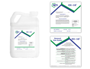
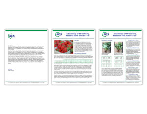
(Shown above: A sample of NanoChem’s new label and brochure design.)
NanoChem Solutions, Inc. provides sustainable solutions through chemistry to many markets, including agriculture, detergents, oil and gas treatments, and water treatments. In 2019, they rebranded and refreshed the look of their image. This means that their existing product labels and research sheets needed to be updated as well. Their redesigned chemical labels feature the pentagon that is a part of their new logo, displaying it in a large scale at the top of the label. Information is listed on front and back labels, and the text wraps around or is arranged beneath the polygons. Because their products are manufactured in batches, the information that needs to be listed at the bottom of the label is left blank and is later made into an editable text field so it may be updated at any time.
NanoChem Solutions extensively researches their technologies and runs field trials to evaluate how their products work. To detail all of the data and information they’ve gathered, they created a variety of research and technical sheets. As part of their rebranding process, these research sheets needed to be updated to reflect the new look and feel of their brand. Using their new letterhead template, the layout of the new brochures showcases a large heading and miniature polygon borders on the top and bottom, framing the copy and pictures in the center. The layout is flexible, and changes from one to two columns depending on the content itself.
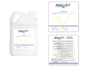
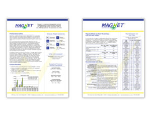
(Shown above: NanoChem’s Magnet product differs from the rest of their standard product line, and was given its own unique appearance to further differentiate it.)
NanoChem’s Magnet product was given special treatment regarding its design. It features its own logo and branded elements, and its label and sell sheets have their own look and feel to them.


